
Building a static blog site with Markdown and Next.js
In recent times we have seen the emergence of new technologies and the evolution of development tools and services on such a scale that we, as developers, could only dream ten years ago.


In recent times we have seen the emergence of new technologies and the evolution of development tools and services on such a scale that we, as developers, could only dream ten years ago.
We can now build very rich content web sites using high-quality open source libraries in JavaScript and UI libraries that look gorgeous out of the box. Making the job for web developers easier and enabling us to deliver top quality products in less time and focus on functionality, content, and reducing time to production, among others.
With all the development tools and services that allow us to build a complete website without the need to have a server, we began to wonder that, in some cases, it's enough to have static content deployed in the cloud (CDN instances) and updated by continuous deployments (CD).
Benefits of Prendering and Server Side Rendering
On the other hand, static sites generators and SSR frameworks solve one of the problems that SPA suffered since it's birth. It's difficult to get Search Engine Optimization or previews of a specific sub-page when sharing on social media, using Single Page Apps, something that can be easily done with Prerendering and/or Server Side.
Besides, SSR and static pages are seldom faster that SPA, due to the reduced markdown rendered from the server in comparison to the JS bundle size of and consecutive calls to the APIs needed from the bootstrap to the complete render on a Single Page Application.
Building a static blog site
Today we're going to build a static blog site using Markdown and a wonderful SSR React framework called Next.js
For this project we'll be using the following packages:
- React Declarative JS library for UI.
- Next.js Isomorphic React on the server and the browser.
- Material-UI Gorgeous UI design out the box.
- MDX "JSX in Markdown for ambitious projects".
- clsx "A tiny utility for constructing
classNamestring conditionally".
The source code repository of this project is available here.
Getting started
Let's begin by creating a new directory for our project, initializing a package.json file and then installing React and Next.js packages,
mkdir blog-next
cd blog-next
npm init -y
npm install --save react react-dom next
Next JS has its own built-in router system ready to use out the box; we just need to create a pages directory,
mkdir pagesAnd we'll be adding new pages as React jsx components as we progress building the blog app.
We're also adding some scripts to package.json,
"scripts": {
  "dev": "next",
  "build": "next build",
  "start": "next start"
}
To start in development mode, build the static content, and start as in production, respectively.
React components with Material-UI
Continuing with the component library picked option (Material-UI), first install the library installing,
yarn add @material-ui/coreNow we need to do some modifications that apply to all the served pages in our site. As Material UI and other react libraries rely on its own styling engine inside JavaScript (CSS-in-JS for Material-UI), then there is no need for the built-in jss-server-side feature that comes by the default in Next.js. To modify this, we override the configuration by adding a page at /pages/_app.js,
import React, { useEffect } from 'react';
import Head from 'next/head';
import { ThemeProvider } from '@material-ui/core/styles';
import CssBaseline from '@material-ui/core/CssBaseline';
import PropTypes from 'prop-types';
import theme from '../components/theme';

function MyApp({ Component, pageProps }) {
  useEffect(() => {
    // Remove the server-side injected CSS.
    const jssStyles = document.querySelector('#jss-server-side');
    if (jssStyles) {
      jssStyles.parentElement.removeChild(jssStyles);
    }
  }, []);
  return (
    <React.Fragment>
      <Head>
        <title>My Next Blog</title>
        <meta
          name="viewport"
          content="minimum-scale=1, initial-scale=1, width=device-width"
        />
      </Head>
      <ThemeProvider theme={theme}>
        <CssBaseline />
        <Component {...pageProps} />
      </ThemeProvider>
    </React.Fragment>
  );
}

MyApp.propTypes={
  Component: PropTypes.oneOfType([PropTypes.node, PropTypes.func]),
  pageProps: PropTypes.object
}

export default MyApp;
As you might noticed, we're also adding a ThemeProvider to get our custom theme for Material-UI. So next step is to create a new folder /components to add new common components as we make progress and also a new theme.js file,
import { createMuiTheme } from '@material-ui/core/styles';
import { red } from '@material-ui/core/colors';

// Create a theme instance.
const theme = createMuiTheme({
  palette: {
    primary: {
      main: '#283E4A',
    },
    secondary: {
      main: '#19857b',
    },
    error: {
      main: red.A400,
    },
    background: {
      default: '#F5F5F5',
    },
  },
});

export default theme;
With these changes in place, we are ready to start building the layout and new components with Material Design 👌.
Web site layout
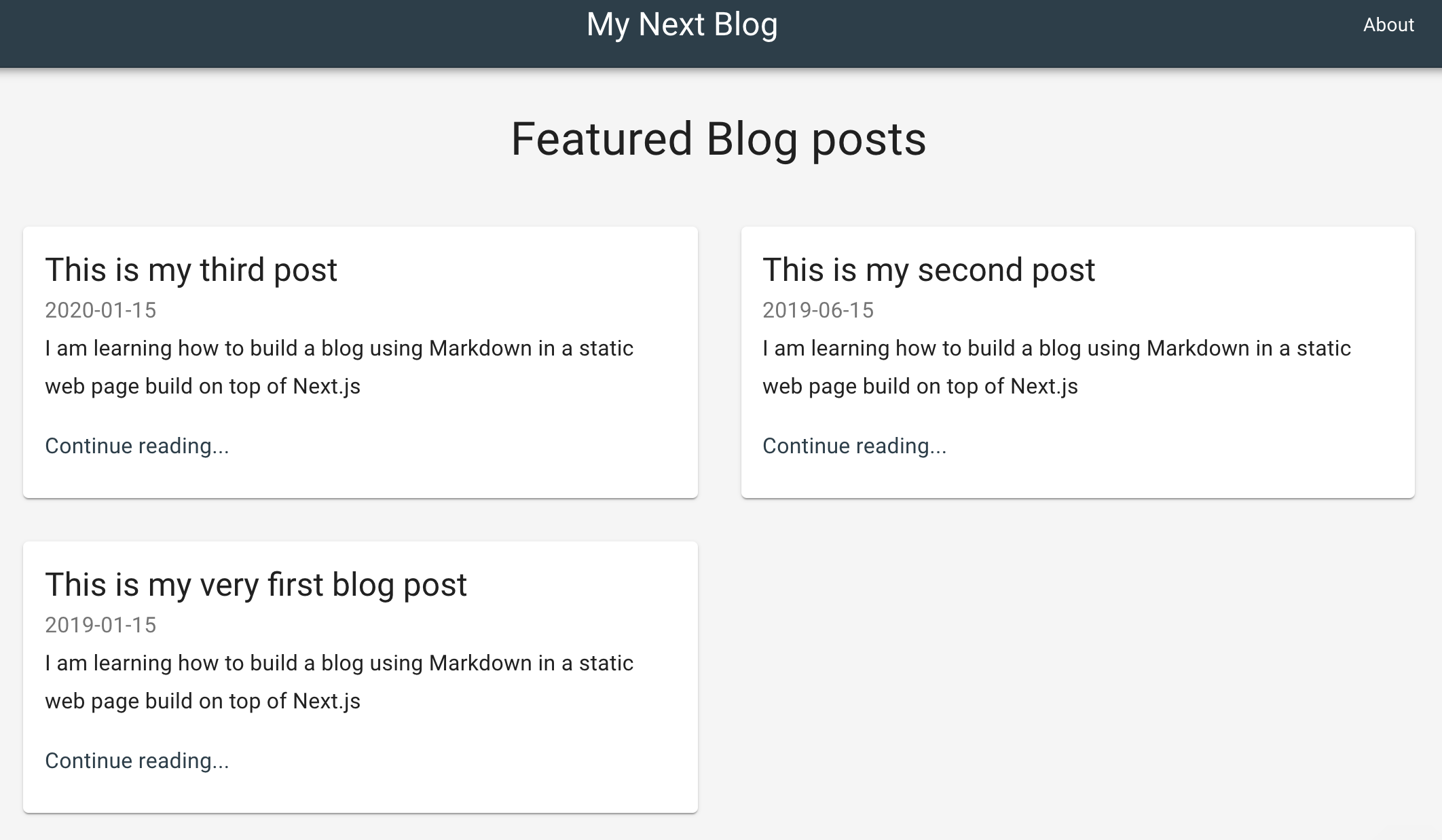
The layout for our blog site includes a navbar with the mail link to home (title) and an about link, a section title for Feature Blog posts and a two-column grid displaying cards with the title, date of publication and a summary of the content for each post,
The first component we need to define is /pages/index.jsx that will also be our landing page at my-domain.com/ where my-domain is the domain for production or simply localhost:3000 if we are in development. Then define the index page as follows,
import React from 'react';
import {
  Container,
  Typography,
  Box,
  Grid,
  CssBaseline
} from '@material-ui/core';
import { makeStyles } from '@material-ui/core/styles';
import Header from '../components/Header';
import PostCard from '../components/PostCard';
import blogPosts from '../data/blog-posts';
import Footer from '../components/Footer';

const useStyles = makeStyles({
  container: {
    minHeight: '80vh'
  }
});

const Index = () => {
  const classes = useStyles();
  return (
    <React.Fragment>
      <CssBaseline />
      <Header />
      <Container maxWidth="lg" className={classes.container}>
        <Box my={4} display="flex" justifyContent="center">
          <Typography variant="h4" component="h1" gutterBottom>
            Featured Blog posts
          </Typography>
        </Box>
        <Grid container spacing={4}>
          {blogPosts.map(post => (
            <PostCard key={post.title} post={post} />
          ))}
        </Grid>
      </Container>
      <Footer title="My Blog" description="Hi there, this is my blog!" />
    </React.Fragment>
  );
};

export default Index;
Here we're making use of other components inside /components directory such as Header for the top navigation panel,or Footer for the bottom panel. These components are relatively small and straightforward; you can take a look at these components at my github repo.
But I'd like to elaborate more on the third component PostCard and the imported array blogPosts, as they are the core elements of the micro-blog engine.
Let's take a look at PostCard.jsx first,
import React from 'react';
import { makeStyles } from '@material-ui/core/styles';
import { Typography, Grid, Card, CardContent } from '@material-ui/core';
import PropTypes from 'prop-types';
import Link from './Link';

const useStyles = makeStyles({
  card: {
    display: 'flex'
  },
  cardDetails: {
    flex: 1
  }
});

const PostCard = ({ post }) => {
  const classes = useStyles();
  return (
    <Grid item xs={12} md={6}>
      <Link href={post.path}>
        <Card className={classes.card}>
          <div className={classes.cardDetails}>
            <CardContent>
              <Typography component="h2" variant="h5">
                {post.title}
              </Typography>
              <Typography variant="subtitle1" color="textSecondary">
                {post.publishedAt}
              </Typography>
              <Typography variant="subtitle1" paragraph>
                {post.summary}
              </Typography>
              <Typography variant="subtitle1" color="primary">
                Continue reading...
              </Typography>
            </CardContent>
          </div>
        </Card>
      </Link>
    </Grid>
  );
}

PostCard.propTypes={
  post: PropTypes.object
}

export default PostCard;
This is a component that expects a prop post that contains a title, publish date, path, or href and summary, as we can see in the layout picture.
Setup Markdown configuration in Next.js
So we need somehow to provide these properties from the blog posts we write in Markdown -inside the pages directory- to the PostCard component to display a preview on the land page. How can we do that?. Well, the answer is that our site is static, so we just read them from the file system!.
But before that, we need to install and configure the package we'll be using to work with Markdown: MDX, which fortunately comes ready to work with Next.js.
We add next and a plugin for next.js,
yarn add @next/mdx @mdx-js/loaderThen create file /next.config.js and include these contents,
const withMDX = require('@next/mdx')({
  extension: /\.mdx?$/
});

module.exports = withMDX({
  pageExtensions: ['js', 'jsx', 'md', 'mdx']
});
This tells next to import files with extension automatically .md and process them as they were JSX files, we'll see that our post are actually both, a JSX React component and a Markdown file at the same time.
Import Markdown posts inside React
Now let's define the JavaScript utility to load the posts in markdown. Let's create folder /data and inside the file get-blog-posts.js,
const fs = require('fs');
const path = require('path');

const META = /export\s+const\s+meta\s+=\s+(\{(\n|.)*?\n\})/;
const DIR = path.join(process.cwd(), './pages/blog/');
const files = fs
  .readdirSync(DIR)
  .filter((file) => file.endsWith('.md'));

module.exports = files
  .map(file => {
    const name = path.join(DIR, file);
    const contents = fs.readFileSync(name, 'utf8');
    const match = META.exec(contents);

    if (!match || typeof match[1] !== 'string')
      throw new Error(`${name} needs to export const meta = {}`);

    const meta = eval('(' + match[1] + ')');

    return {
        ...meta,
        path: '/blog/' + file.replace(/\.mdx?$/, '')
      };
  })
  .filter((meta) => meta.published)
  .sort((a, b) => new Date(b.publishedAt) - new Date(a.publishedAt));
This function looks inside folder /pages/blog/ for any file with extension .md and inside each file, it expects an object called meta, where the properties of the post (title, path, summary and publish date) resides, which is what the function exports in the end.
Then let's look how a blog post show looks like,
import BlogPost from '../../components/BlogPost';

export const meta = {
  published: true,
  publishedAt: '2019-01-15',
  title: 'This is my very first blog post',
  summary:
    'I am learning how to build a blog using Markdown in a static web page build on top of Next.js'
};

export default ({ children }) => <BlogPost meta={meta}>{children}</BlogPost>;

Lorem ipsum dolor sit amet, consectetur adipiscing elit. Quisque maximus pellentesque dolor non egestas. In sed tristique elit. Cras vehicula, nisl vel ultricies gravida, augue nibh laoreet arcu, et tincidunt augue dui non elit. Vestibulum semper posuere magna, quis molestie mauris faucibus ut. Praesent ornare velit sit amet enim semper lacinia. Aenean nec sem lacus. Cras porta nunc nec leo lacinia sagittis. Aliquam ornare gravida cursus. Etiam ultrices massa quis erat scelerisque rhoncus. Vestibulum ante ipsum primis in faucibus orci luctus et ultrices posuere cubilia Curae; Proin lacinia sodales augue, non mattis ipsum pretium non. Morbi vehicula tempor blandit. Nam rhoncus, massa a maximus imperdiet, tortor risus aliquet tortor, nec lacinia eros nisi volutpat massa. Maecenas ut augue ipsum.
That is the first part of a post at /pages/blog/my-first-post.md (note that I added a sub dir blog inside pages, to keep the posts apart from the other pages). It starts by importing a React component BlogPost, which is the frame for the contents of the blog, we'll see it in just a minute. Then we have the meta-object with the meta-data of the blog post, a default export of this JSX file (a react component) and then, finally, the post content!, and that's it, how it's we write a post in our blog, simple and neath. 🙂
Dealing with static resources
Going back to our preview of the posts on the index page, we should be able now to import the meta-data and display it in the cards. However, we still need an extra step, as we work with static data, the import should happen at compile-time, and a regular import won't work because when it's executed in the browser, it will try to bring data up that is in the server. What is the solution for this challenge?, we pre-evaluate the contents given by get-blog-posts.js in the server, before they're served to the client. For this, we'll use a couple of plugins available in babel: babel-plugin-macros and babel-plugin-preval,
yarn add --dev babel-plugin-macros babel-plugin-prevalAdd a file .babelrc and the contents,
{
    "presets": ["next/babel"],
    "plugins": ["macros"]
}
And we add a file at /data/blog-posts.js and this is where the magic happens,
import preval from "babel-plugin-preval/macro";

module.exports = preval`module.exports = require('./get-blog-posts.js');`;
The last line pre-evaluates the contents retrieved by get-blog-posts.js, so we are really exporting the array of meta objects, instead of the function to fetch them.
Displaying a blog post as a stand-alone page
Finally, we'll see how the a blog post is going to look,
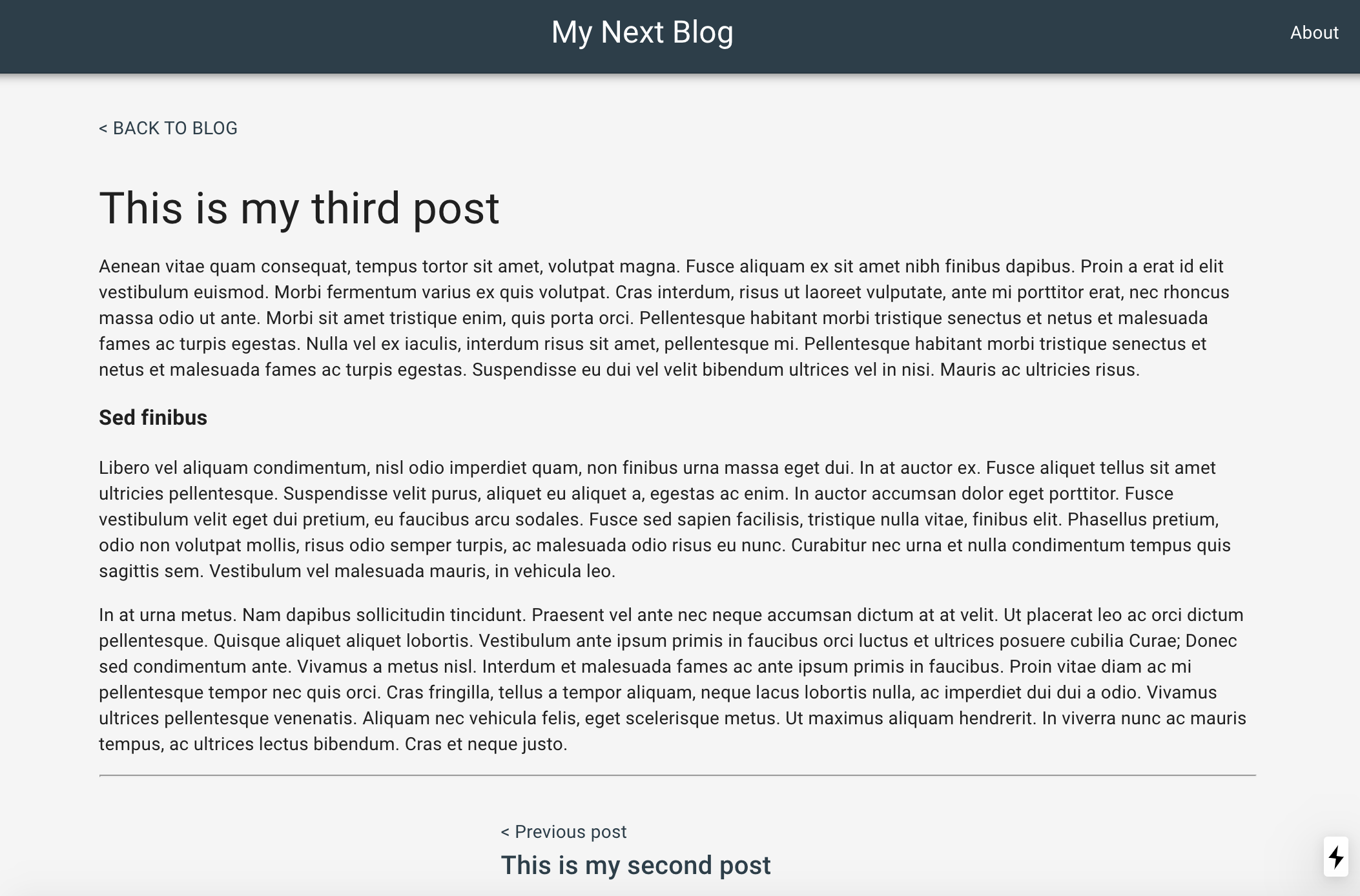
We have the navigation and footer panels on the index page. Also a link "Back to blog" on the upper left, to return to the landing page,a couple of links in the lower section of the post, to go to previous and/or next blog, for what we need to use blog-posts.js again here.
import React, { Fragment } from 'react';
import Link from './Link';
import Header from './Header';
import blogposts from '../data/blog-posts';
import { Container, Box, Typography } from '@material-ui/core';
import Footer from './Footer';

const NextPost = ({ href, position, title }) => (
  <Link href={href}>
    {position}{' '}
    <Typography variant="h6" component="h6">
      {title}
    </Typography>
  </Link>
);


const BlogPost = ({ meta, children }) => {
  const current = blogposts.map(({ title }) => title).indexOf(meta.title);
  const next = blogposts[current - 1];
  const prev = blogposts[current + 1];

  return (
    <Fragment>
      <Header />
      <Container maxWidth="md">
        <Box my={4}>
          <Link href="/">{'< '} BACK TO BLOG</Link>
        </Box>
        <Typography variant="h4" component="h1" gutterBottom>
          {meta.title}
        </Typography>
        {children}
        <hr />
        <Box my={4} display="flex" justifyContent="center">
          <Box mx={4}>
            {prev && (
              <NextPost
                href={prev.path}
                position="< Previous post"
                title={prev.title}
              />
            )}
          </Box>
          <Box mx={4}>
            {next && (
              <NextPost
                href={next.path}
                position="Next post >"
                title={next.title}
              />
            )}
          </Box>
        </Box>
      </Container>
      <Footer title="My Blog" description="Hi there, this is my blog!" />
    </Fragment>
  );
};

export default BlogPost;
...And this is it!. You can now start your awesome blog posts. 🙌🏼
If you wish to go live, there is an excellent hosting option at vercel.com, where you can very quickly deploy your project with direct CD integration with GitHub, and you don't even need a credit card to start.
Thank you for reading my blog!. Please keep up with the latest updates in my channels. Cheers!.